Case Study
- Web
- Digital
- Experience
- Content
DIBA Foods
© 2025
Food Supplier
Amsterdam, Netherlands
About
DIBA Foods is a Netherlands-based food supplier focused on premium rice, traceable sourcing and consistent quality.
Following a change in ownership, the business needed a website that reflected its standards and gave buyers, partners and investors greater confidence in the company.
Quality Needed to Look Like Quality
DIBA wanted to become synonymous with quality, but its website was communicating the opposite. Broken links, inactive buttons, an unreliable enquiry form and outdated information weakened trust. Inconsistent typography, colours and page layouts also made the business feel incomplete and difficult to distinguish from other food suppliers.
A website audit, analytics review and competitor research helped define the opportunity. While competitors often presented their products more clearly, many relied on similar navy-led corporate identities. The redesign had one objective: make the quality of the business visible before a visitor needed to ask for proof.
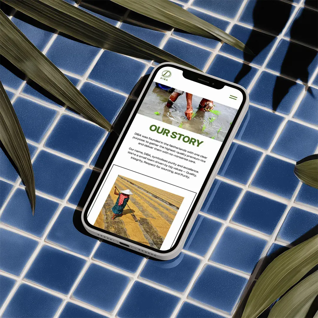
Built Around Product Discovery
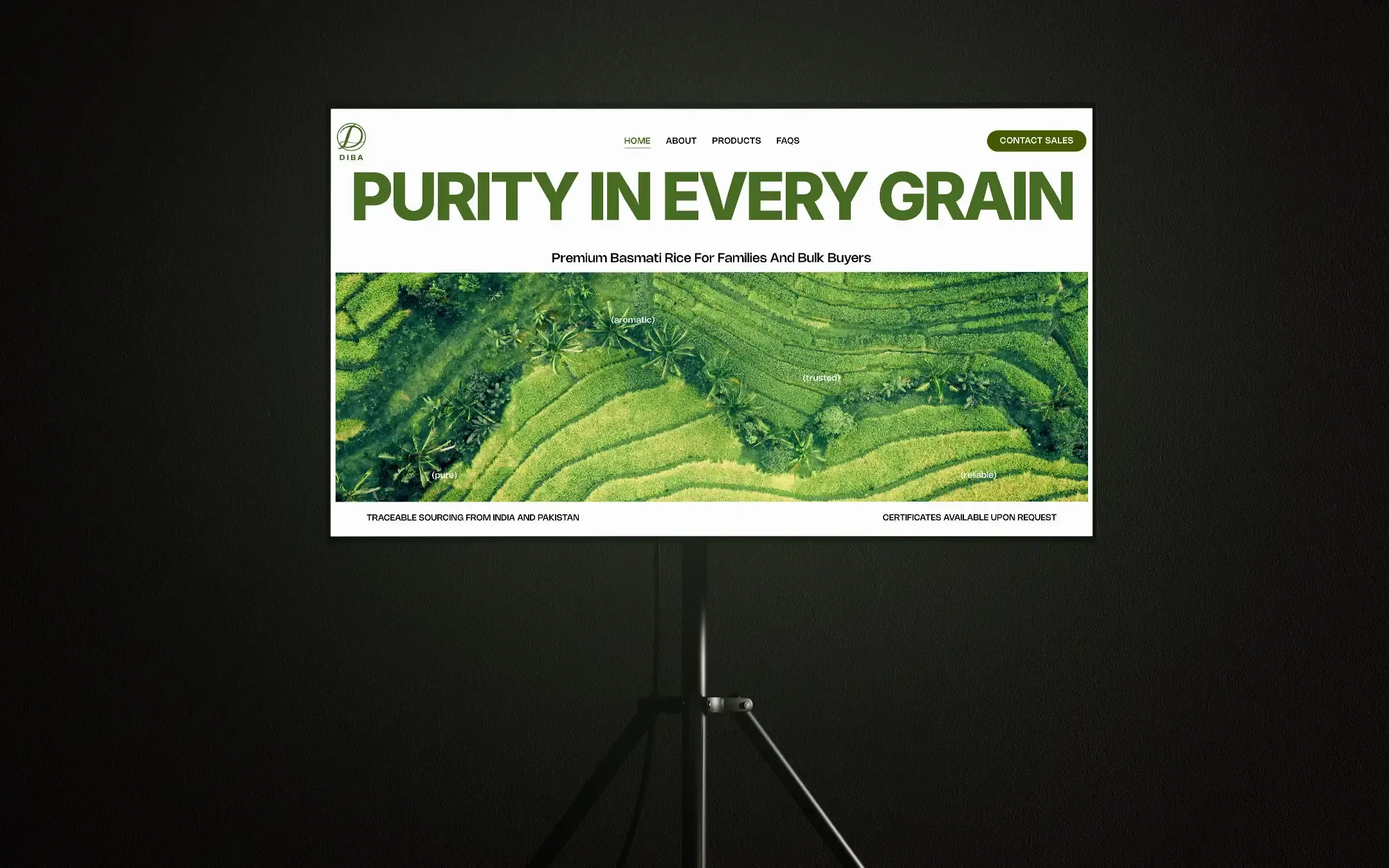
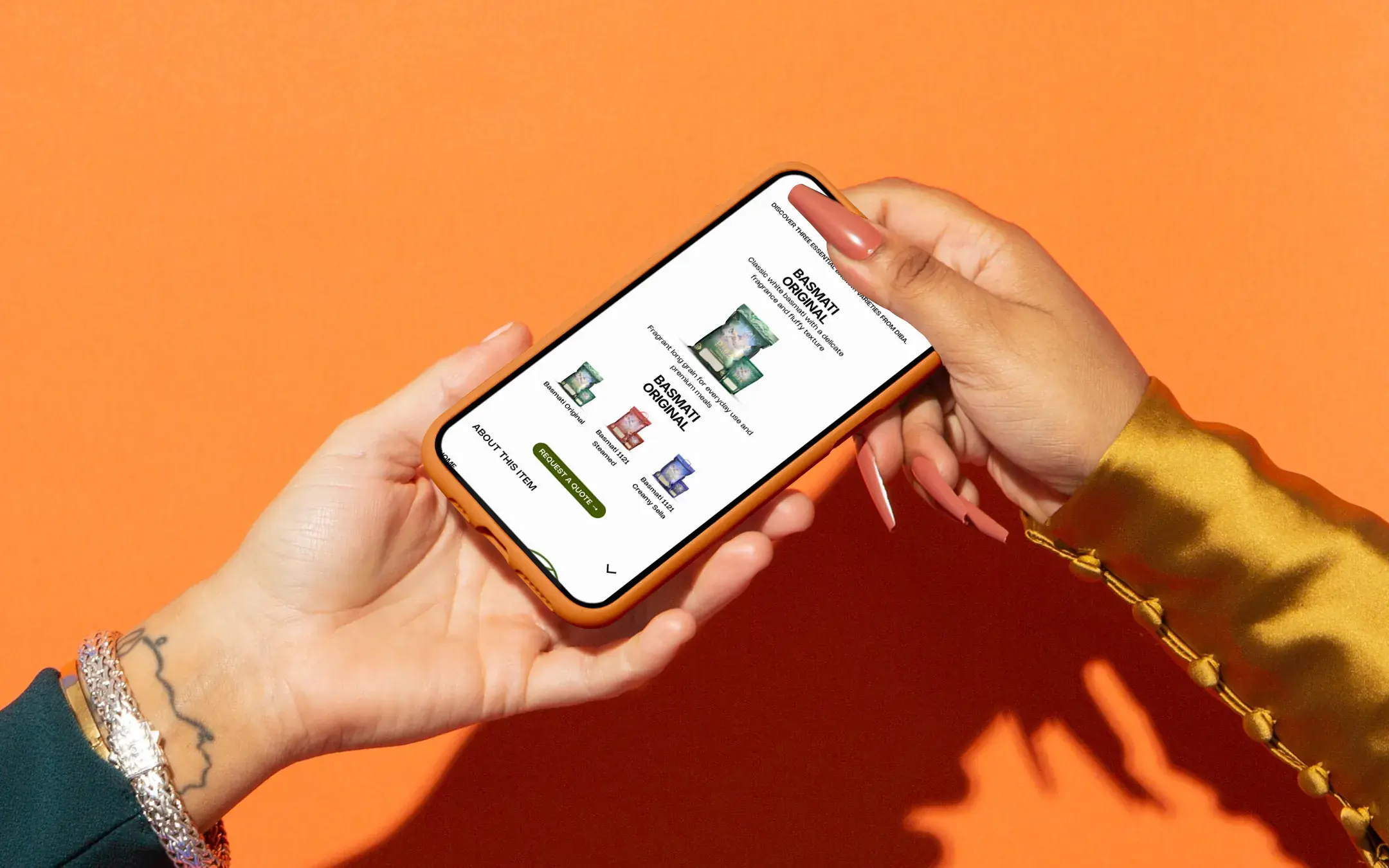
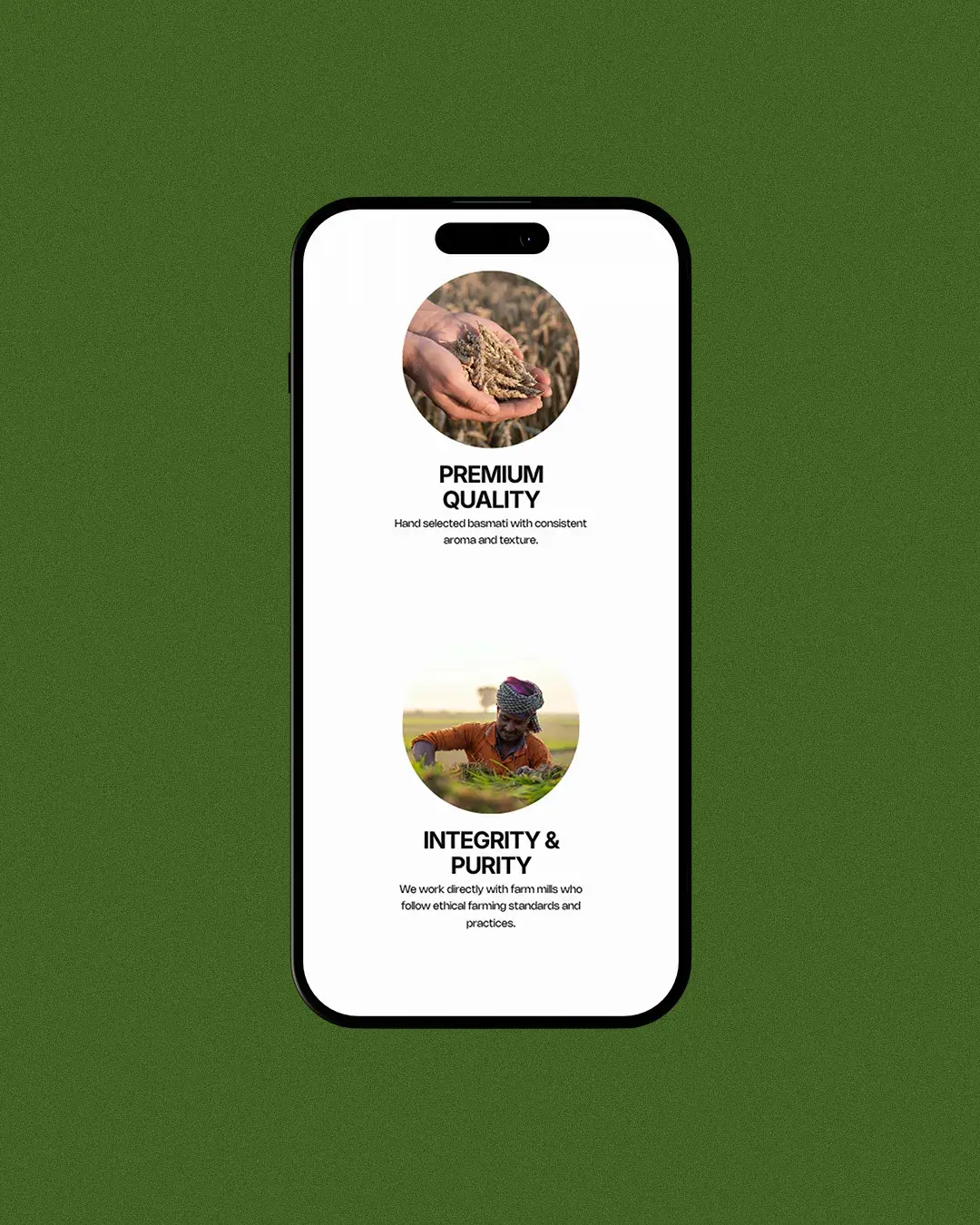
The new website introduces DIBA’s values, sourcing standards and product range before guiding visitors towards the information most relevant to them. Dedicated templates separate Original, Steamed and Creamy Sella rice through clear descriptions, specifications and enquiry options, helping retail and bulk buyers compare the products more easily.
The information architecture was designed around the questions that matter first: what the product is, where it comes from, how it performs and how to request pricing or samples.
A More Credible Digital System
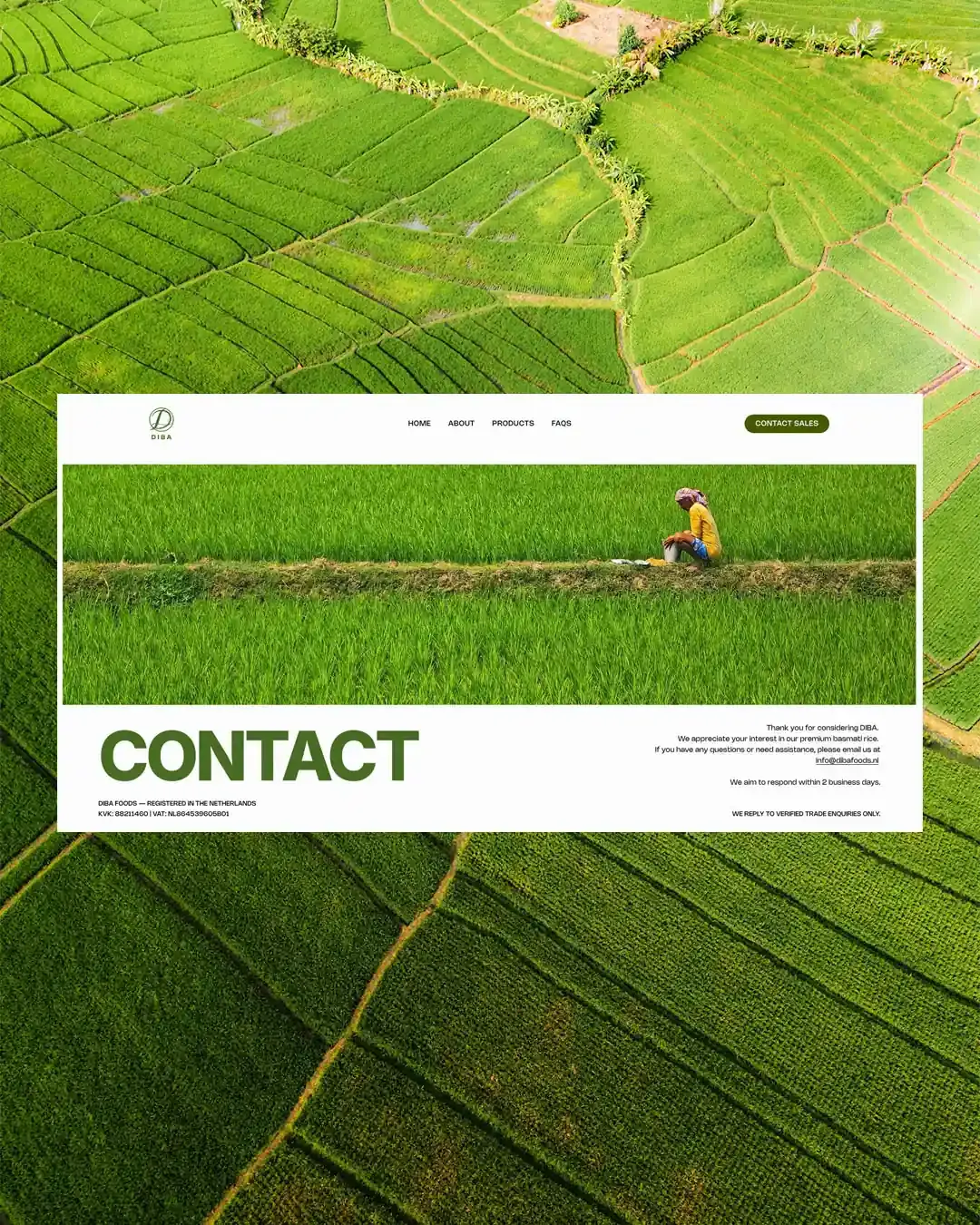
The final direction moves away from the navy-led visual language common across the category. Green, warm neutrals and black typography connect the website to agriculture, purity and provenance. Controlled spacing and properly sourced imagery bring greater consistency across the experience. The existing logo was also rebuilt from a low-resolution file so it could remain legible and consistent.
The system was applied responsively across the agreed pages and templates, with accessibility, navigation and the enquiry journey considered throughout. Custom CSS supported the product-switching experience, while broken actions and contact journeys were corrected so the website could function as a practical business tool.
Outcome
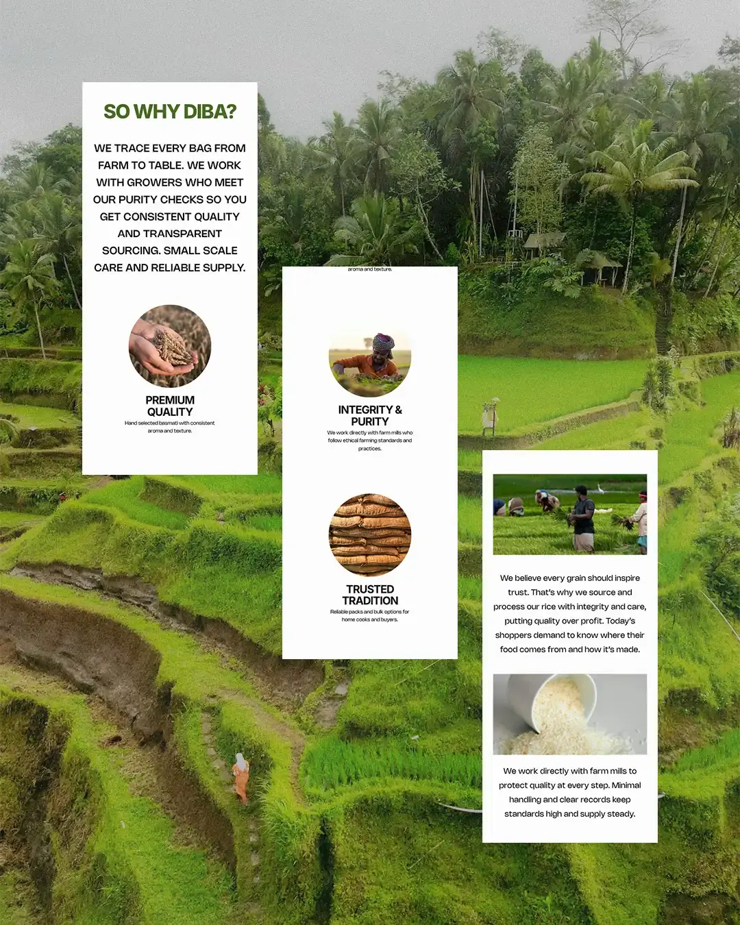
DIBA now has a clearer and more credible digital presence that reflects the standard of its products. The website gives buyers a simpler way to explore the rice range, understand the company’s values and contact the sales team. It also gives the business a stronger foundation for investor conversations, range expansion and entry into new markets.
Following its launch, DIBA Foods secured funding to expand its range and enter international markets.
Working on something similar?