Case Study
- Identity
BLNK
© 2025
Padel Club
Berlin, Germany
About
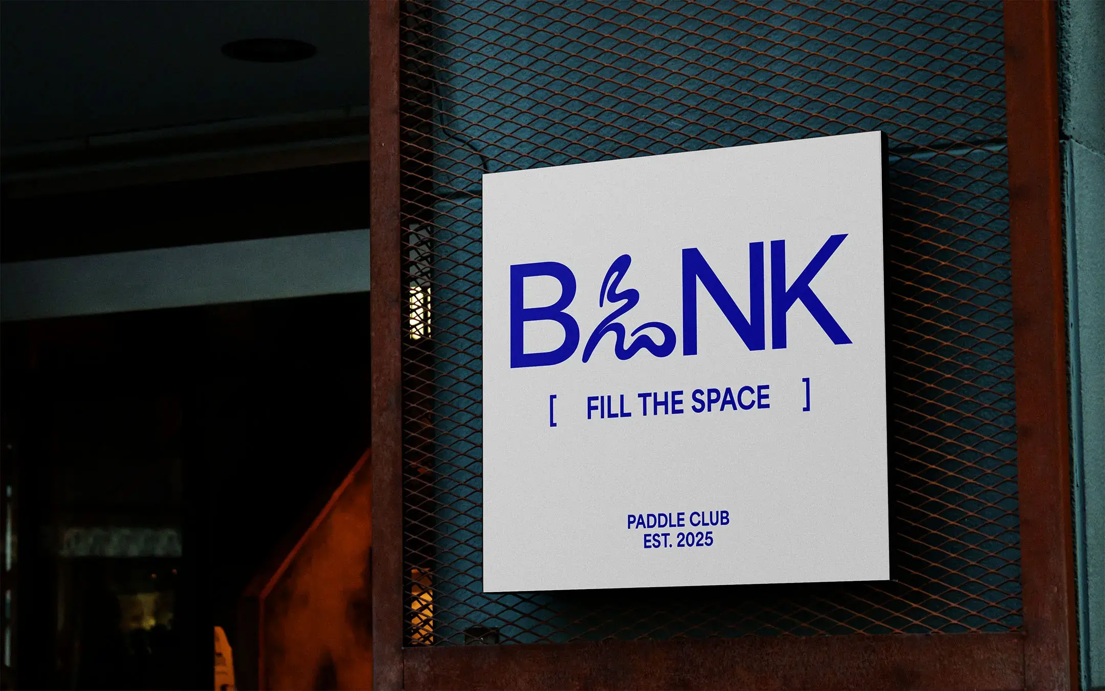
BLNK is a padel club brand shaped by the space between movement, focus and city life.
The identity was designed to make the club feel like more than a place to play. It needed to create belonging, give the space a visual language and help the brand stand apart in a growing sports and lifestyle category.
Accolades
Braaands - Brand Of The Day
Contra - Honourable Feature
Fill the Space
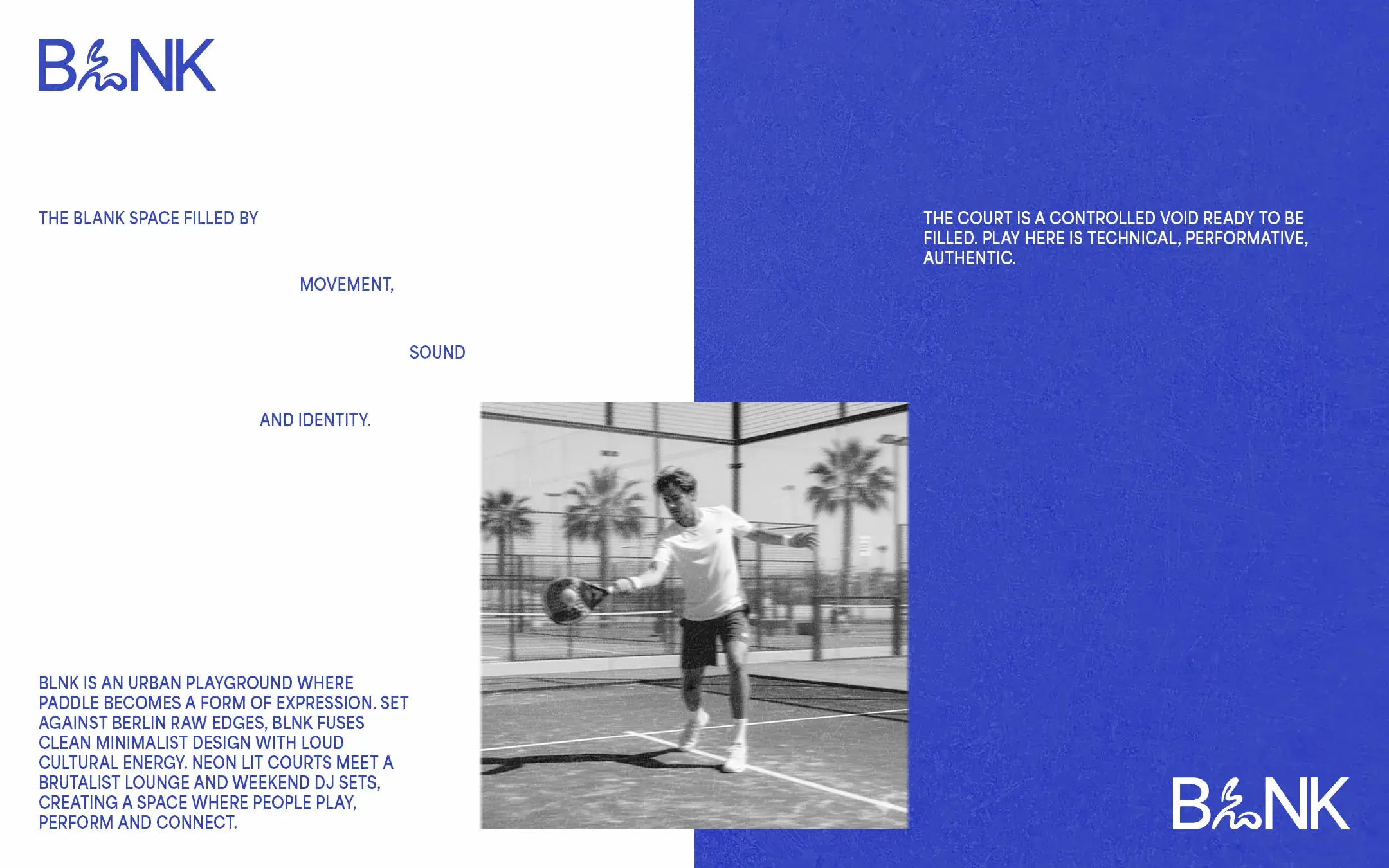
The central idea was simple: fill the space.
The court became the blank space. A controlled environment left open for movement, sound, competition and identity. This gave BLNK a strong point of view and helped move the brand away from the softer visual language often used by leisure clubs. BLNK needed to feel sharper, more active and more connected to the pace of the city.

Built for Movement
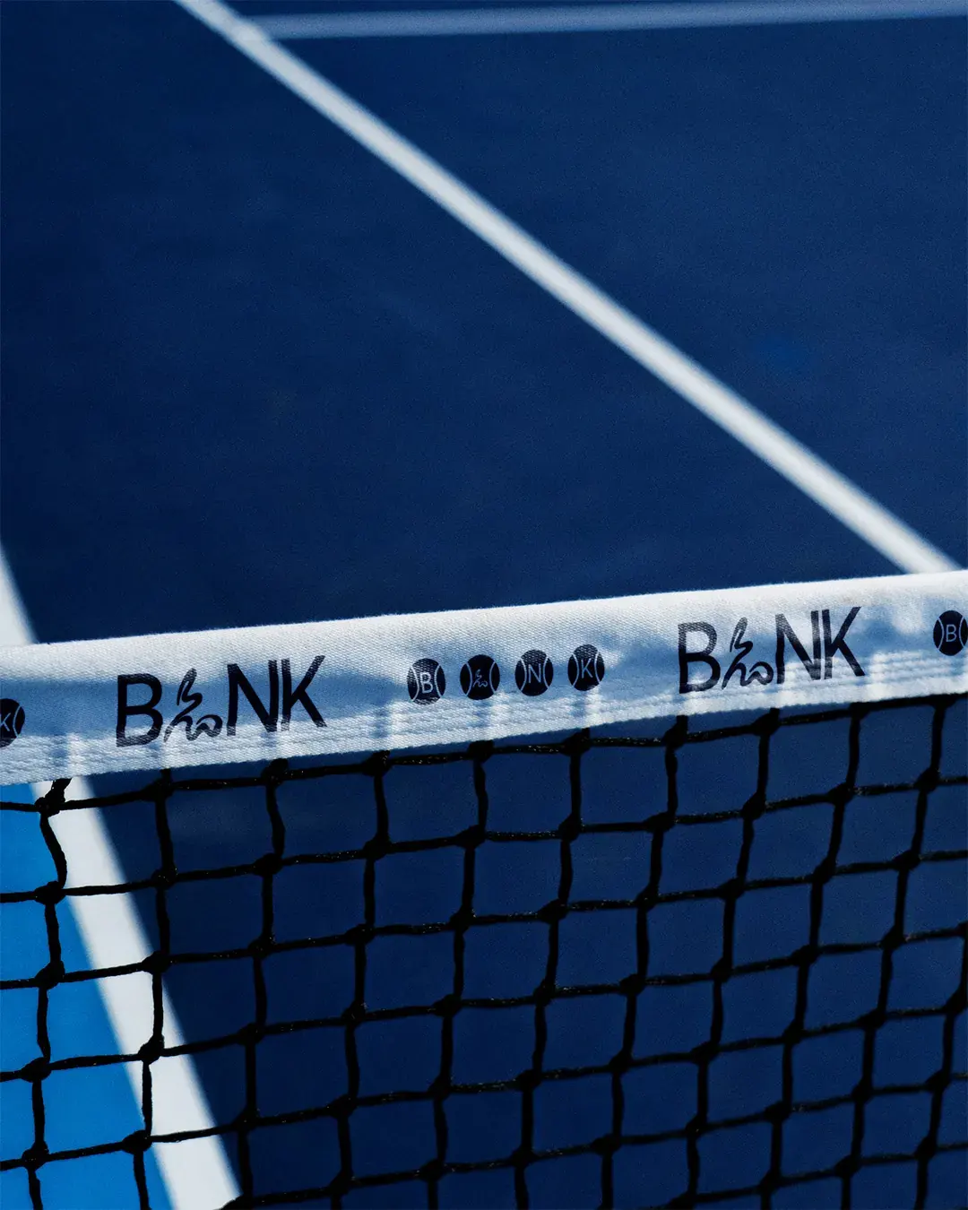
The visual system was designed to feel controlled without becoming still. An early version of the wordmark used a simple uppercase sans serif, but it didn’t reflect the movement at the centre of the club. The L was redrawn to follow the motion of a player serving or striking the ball, giving the mark a more active centre without disrupting its structure.
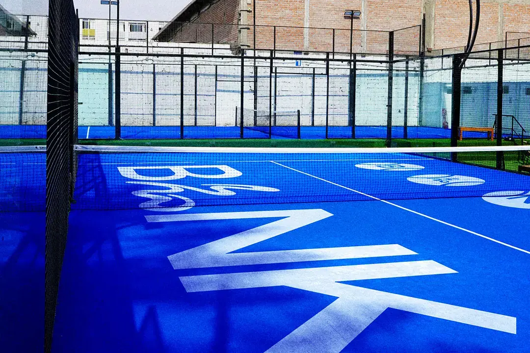
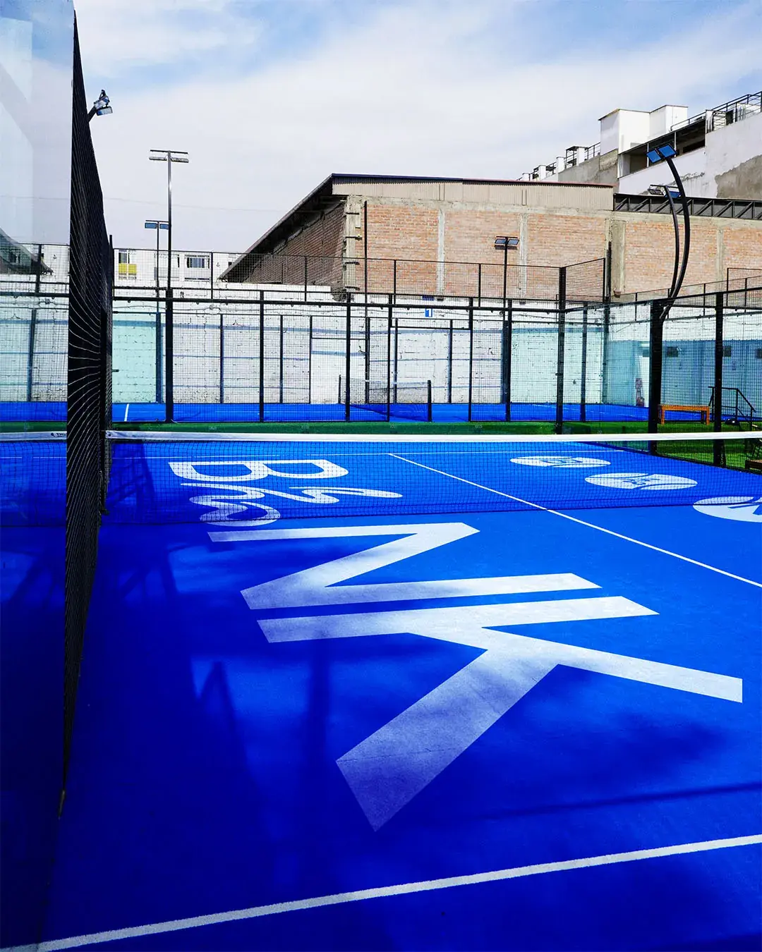
The individual letterforms were then carried into the padel ball graphics used across the court and net, helping the identity move beyond the wordmark itself. Large typography, strong spacing and a deep blue palette give BLNK immediate presence across signage, apparel and digital material.
The Club Beyond the Court
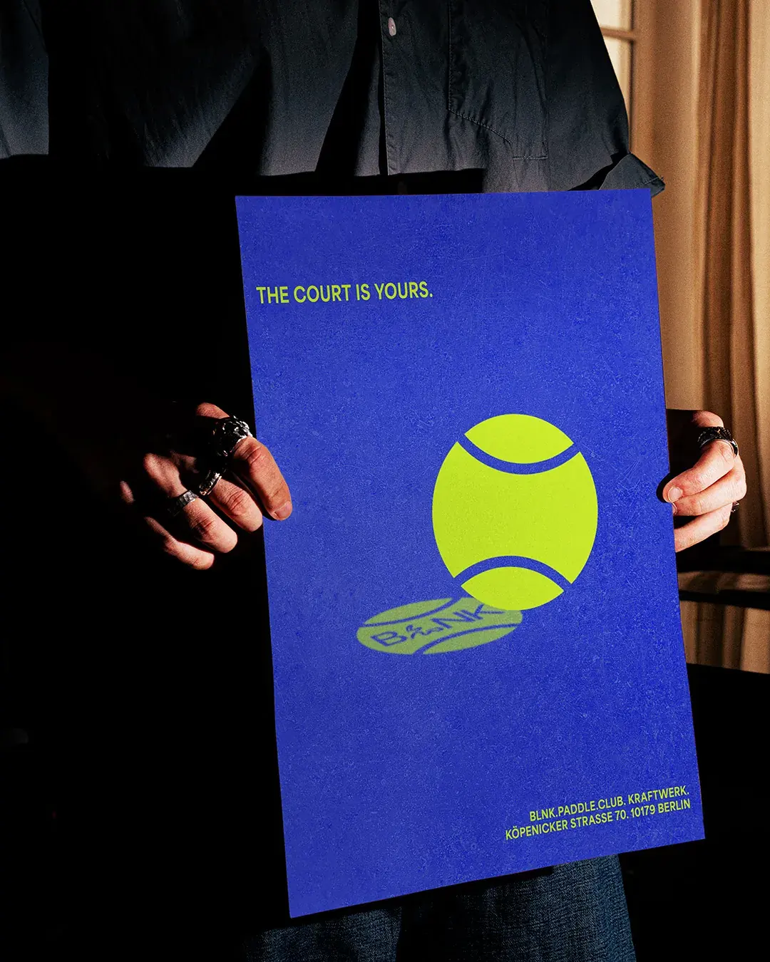
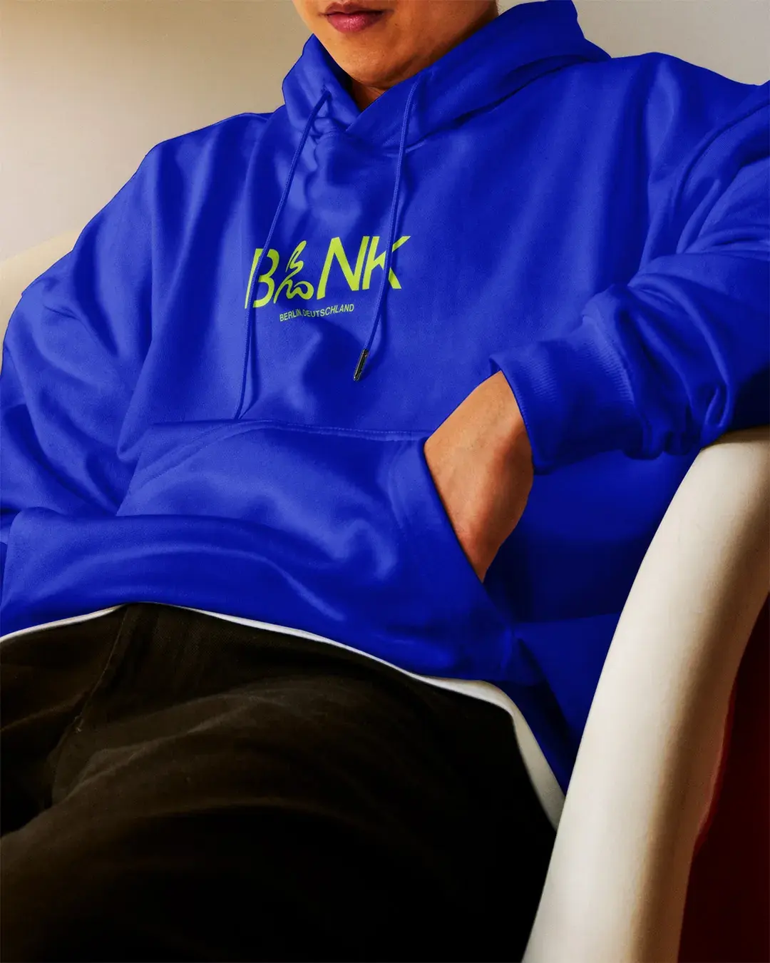
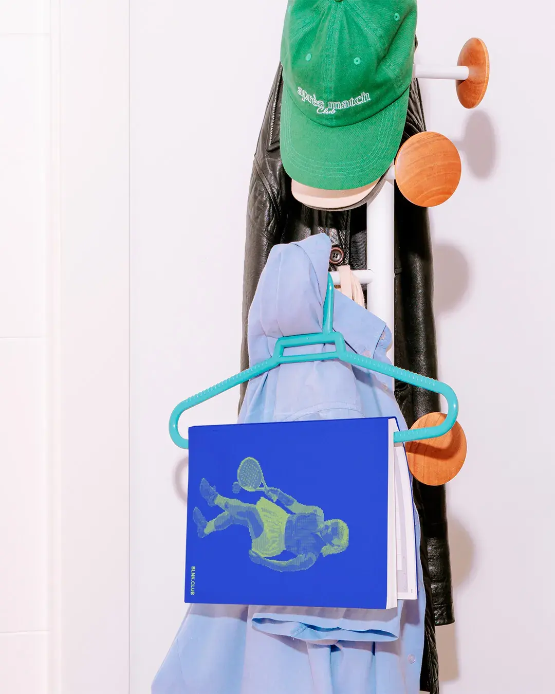
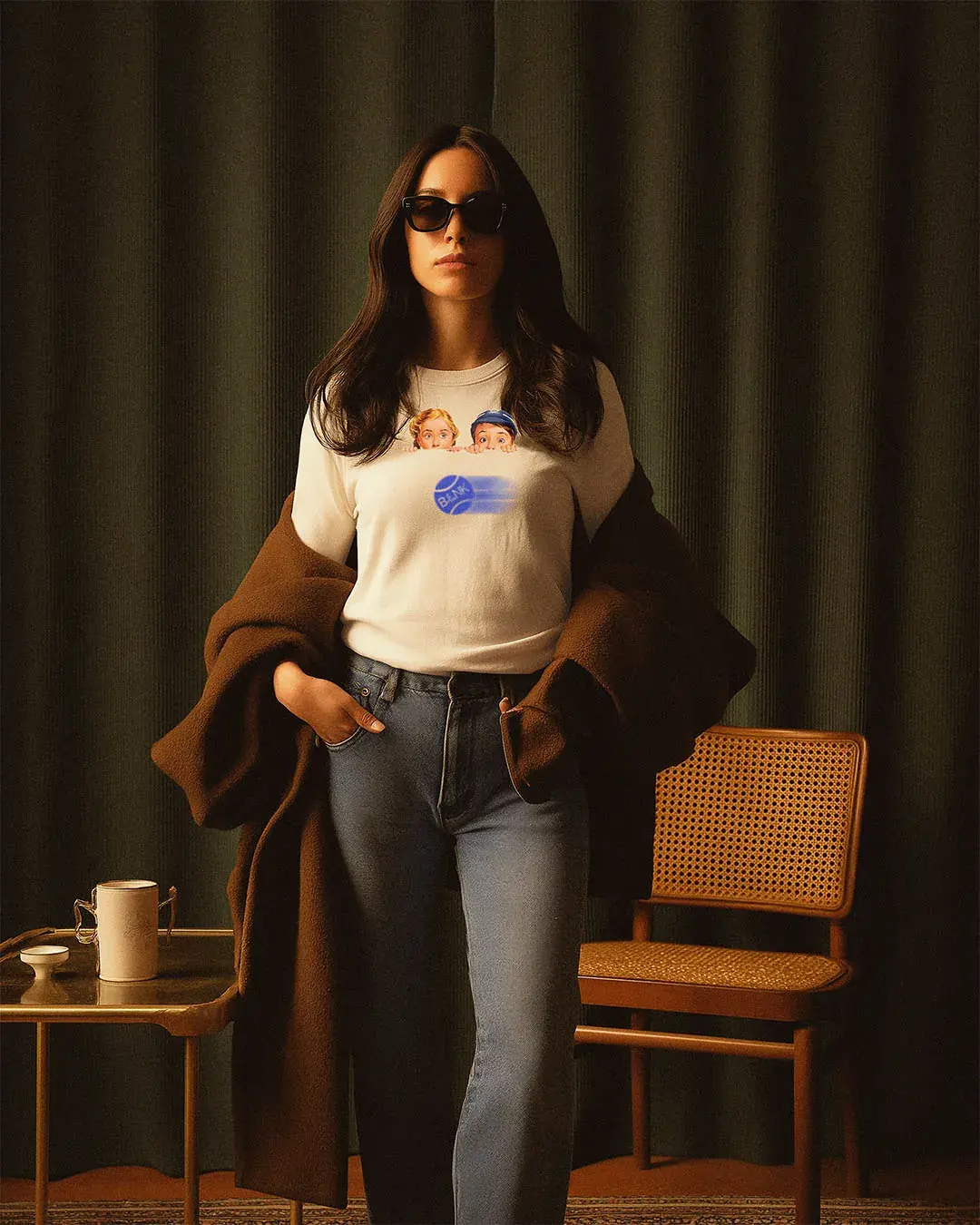
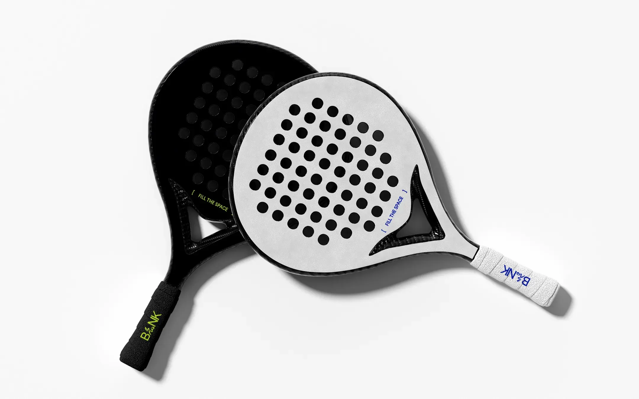
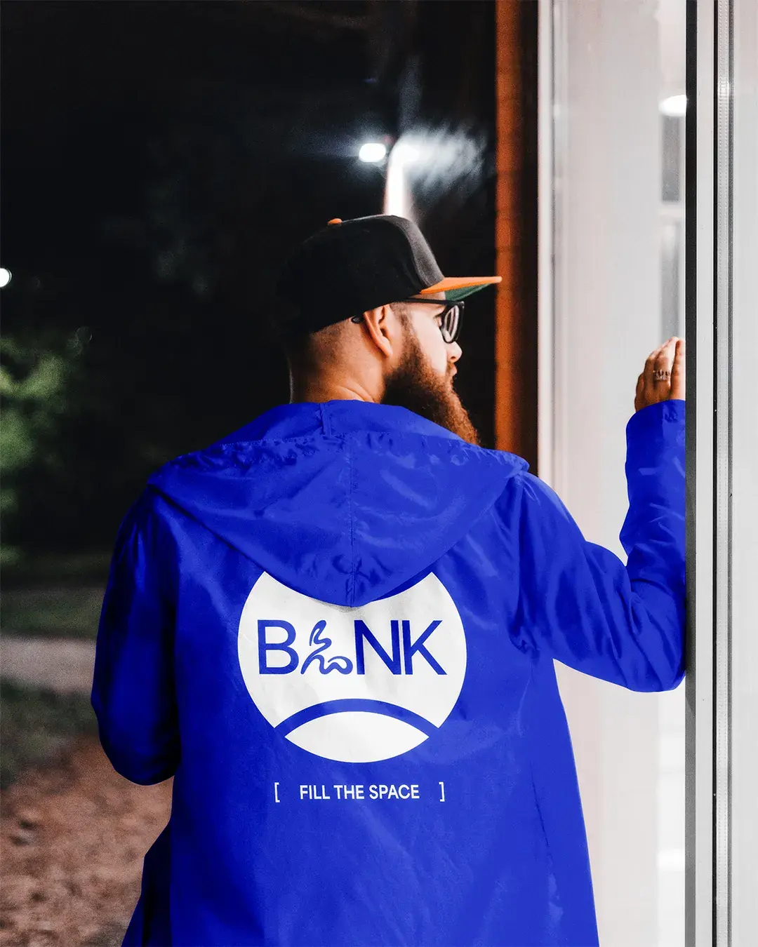
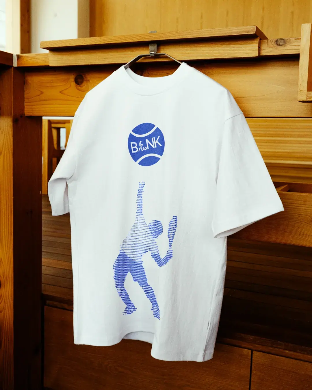
BLNK needed to work as a club people could belong to, not just a space they booked. Merchandise gives the identity a life outside the venue. Jackets, T-shirts, headbands, paddles and printed material carry the same colour, mark and compact messaging, making the brand more visible in everyday settings.
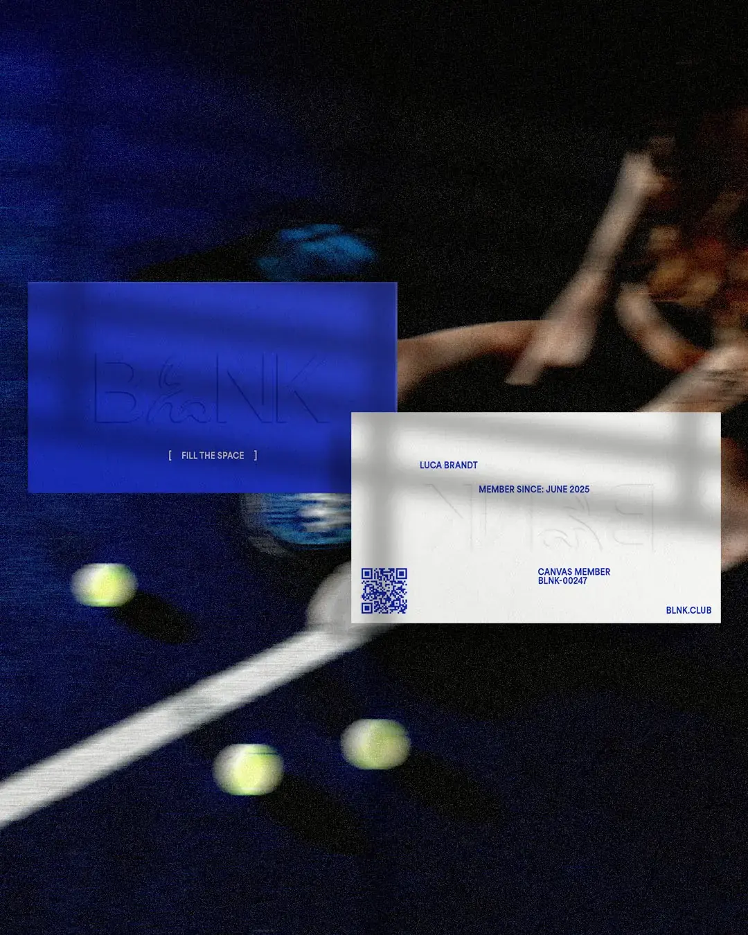
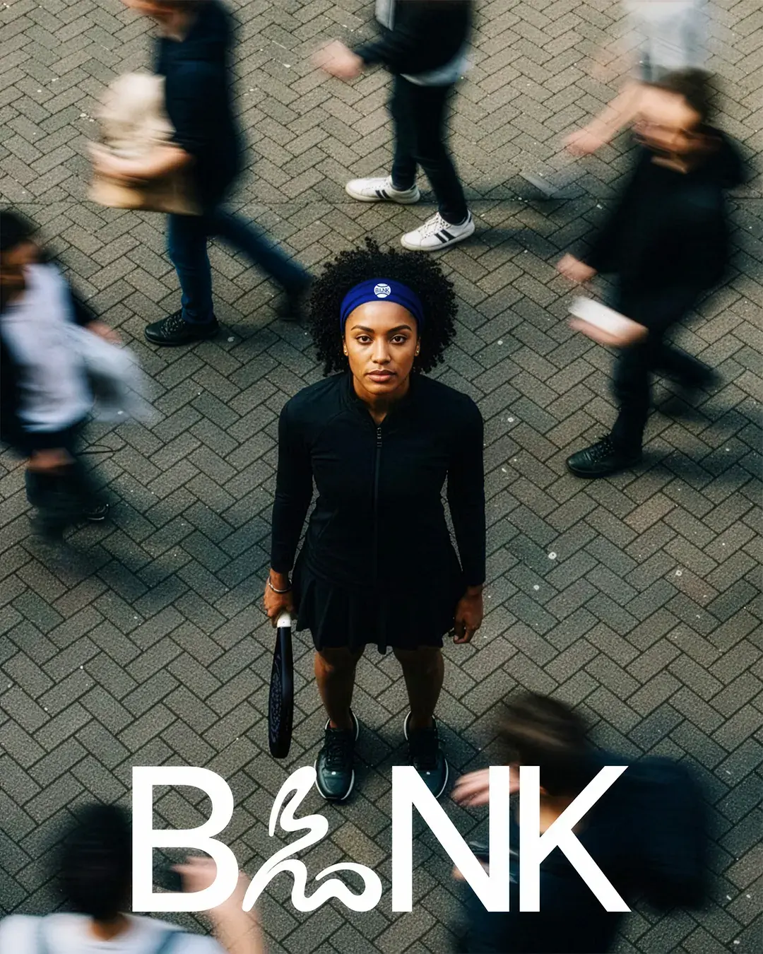
The membership cards and campaign visuals extend that further. They make BLNK feel like a club system, not just a logo placed across sportswear.
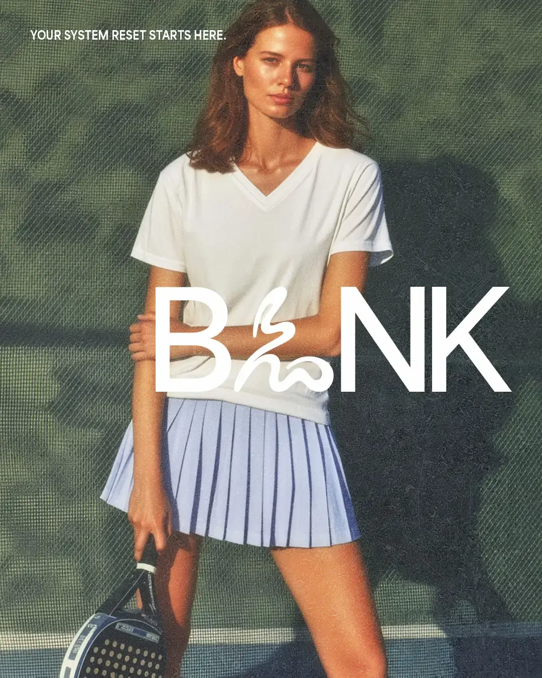
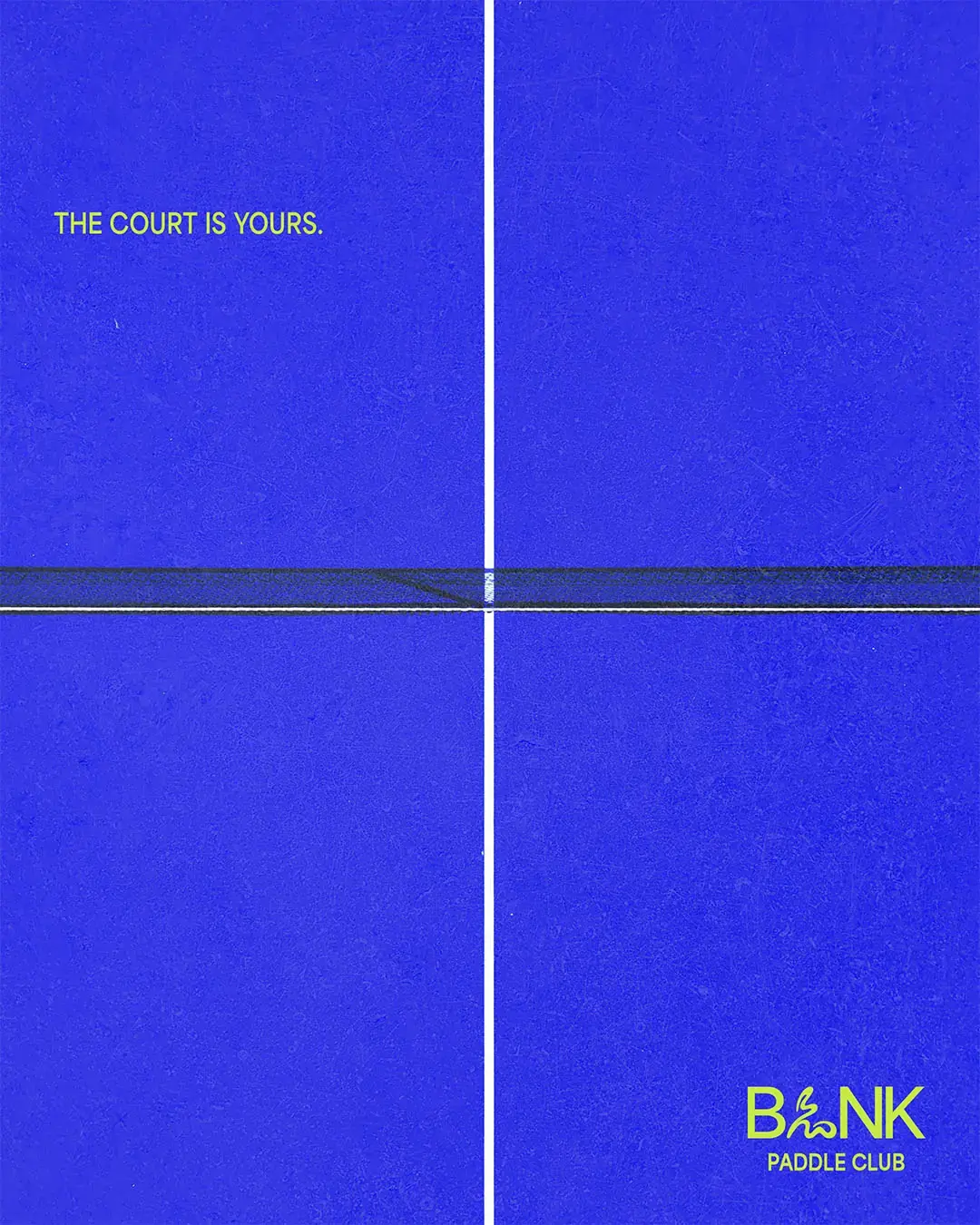
For social content, the system gives the brand a recognisable rhythm. Short statements, bold type and action-led imagery make posts easy to read quickly while keeping the energy tied back to the game.

Part of the Game
The court application turns the identity into part of the playing experience. Large-scale typography, strong blue surfaces and clean placement make the space feel recognisable from the moment someone steps inside. The brand doesn’t sit around the court. It becomes part of how the club is seen, remembered and shared.
Outcome
BLNK now has a visual system that can move across the full club experience, from the court to clothing, membership and content. The identity gives the club a stronger presence, a clearer sense of belonging and a repeatable way to build recognition as its community grows.
Working on something similar?